


Note from the designer:
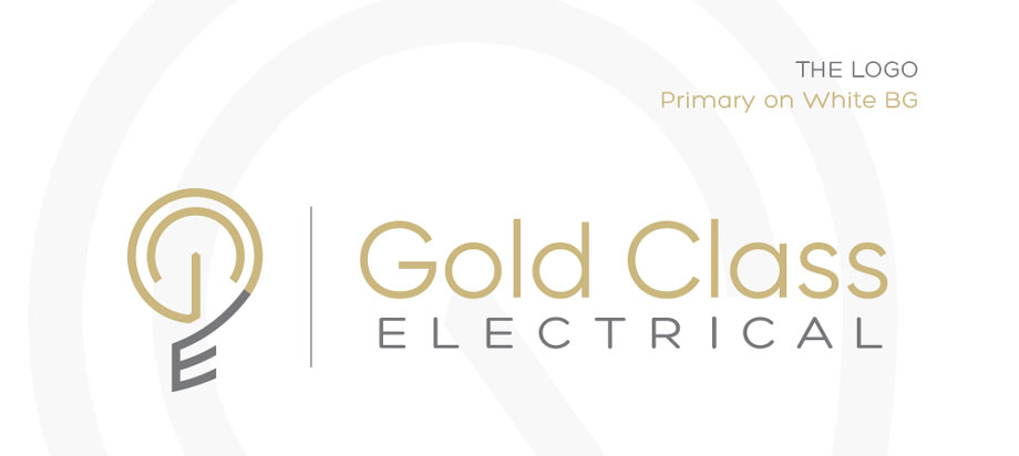
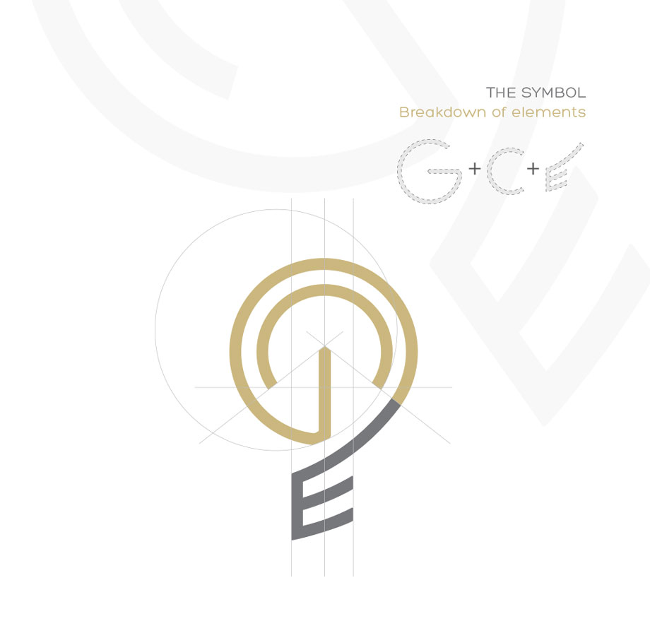
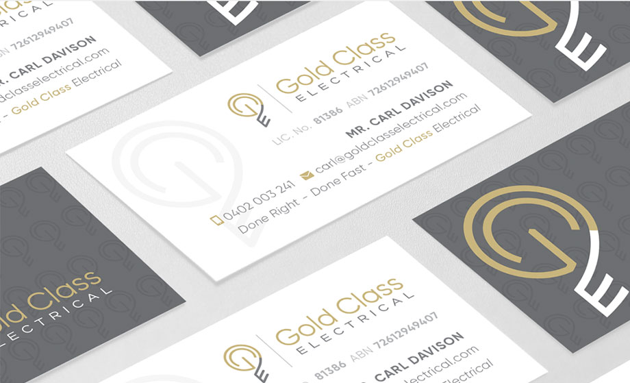
Absolutely without a doubt one of my most highly favoured minimal logo designs to date. Initially, owner of Gold Class Electrical, like a lot of electrical business owners, wanted the logo and brand to represent that of electricity through the use of stereotypical visuals like light bulbs, power points, etc… but didn’t like the cliché idea of just “following the crowd” in what everyone else was doing. He wanted a unique twist on this approach to stand out. He also liked the idea of just having GCE as the logo, cleanly abbreviated. So, pencil to paper, some scribbling was done and I had discovered that through the use of the abbreviation GCE I accidentally created this visual that almost resembled both a power on / standby symbol… and a lightbulb, in one. The rest is history. Carl loved the finished result, as did I, and we carried this branding on through other mediums of his brand from the business cards through to the vehicle signage.